Fintech branding. Why most fintech companies look the same.
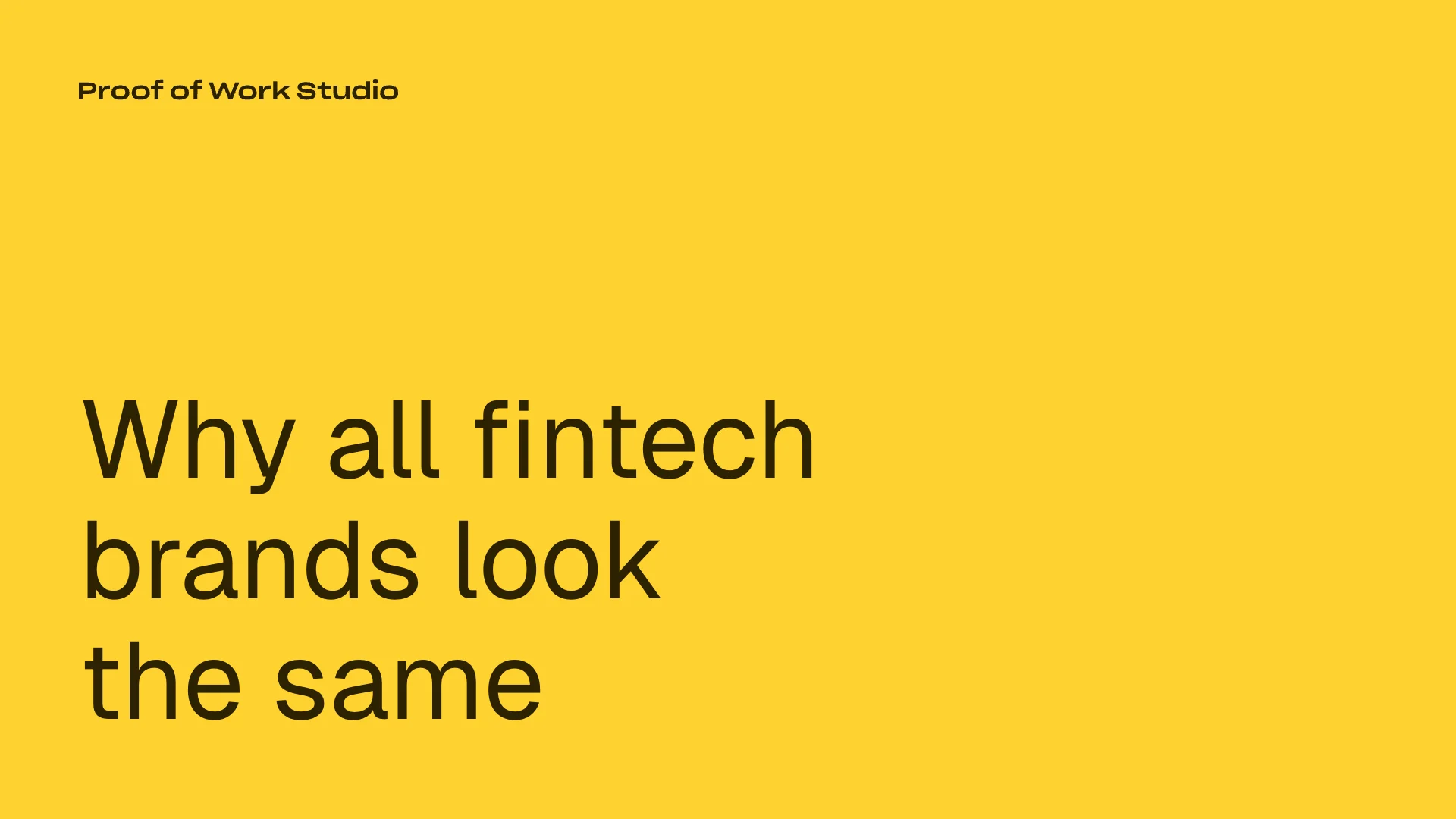
Open 10 fintech websites in a row. Count the blue gradients. Count the stock photos of people smiling at their phones. Count the taglines about "making finance simple." You'll run out of fingers.
Most fintech companies look the same because they're copying each other instead of thinking about their customers. And when everyone copies everyone, nobody stands out.
The blue gradient problem
Blue means trust. Every fintech founder has been told this, usually by a designer who read the same colour psychology blog post as every other designer. So they pick blue. Then they add a gradient because flat blue feels boring. Then they round the corners on everything because Stripe did it and Stripe is successful.
The result is an industry where a compliance platform, a neobank, a lending marketplace, and a payments processor all look like slightly different versions of the same company. The visual language signals "fintech" without signalling anything specific about the product.
This is a branding failure. The whole point of a brand is to differentiate. If your brand looks like your competitors, it's doing the opposite of its job.
Why it happens
Three reasons.
Reference bias. When founders brief a designer, they share references. Those references are almost always other fintech companies. The designer produces something that looks like the references. The founder approves it because it looks like what they expected. Nobody stops to ask whether looking like everyone else is actually the goal.
Safety over specificity. Early-stage companies are nervous about being too different. They want to look credible, and credible in fintech means looking like the established players. So they default to the same visual language. The irony is that this makes them look less credible, not more, because it signals that they don't have a strong point of view.
Branding too early or too generically. Some companies brand before they know who their customer really is. They pick a visual direction based on the category rather than the specific person they're selling to. A B2B payments company selling to CFOs and a consumer savings app selling to 25-year-olds should look completely different. But if both brief their designer with "we're a fintech," they'll end up in the same visual territory.
What differentiation looks like
Wise. Before the rebrand, they were TransferWise with a fairly standard fintech look. After, they built one of the most distinctive brands in financial services. The green is bold. The typography is confident. The brand system extends into the product in a way that makes the app feel like the brand, not a separate thing. They didn't look at other fintech companies for references. You can tell.
Revolut's early identity. The original Revolut brand had an edge to it. Dark, sharp, a bit aggressive. It matched the product's positioning as the challenger that would make traditional banking feel slow and expensive. It stood out precisely because it didn't look like a bank and didn't want to.
Mercury. Clean, warm, and human. Mercury's brand looks more like a premium consumer product than a business bank. That's deliberate. They understood that their customers, startup founders, don't want their bank to look corporate. They want it to feel like a product they'd actually choose to use.
The test
Look at your brand without the logo. Remove the company name. Could you tell it's your company and not a competitor? If the answer is no, your brand isn't doing enough.
The best fintech brands don't look like fintech brands. They look like the specific company they are. Wise doesn't look like Revolut. Mercury doesn't look like Wise. That's the point. They built their brand around their specific product, customer, and positioning. Not around the category.
If your designer's first instinct is to show you blue gradients and rounded corners, push back. Ask them to show you something that could only be your company. That's where good branding starts.